


How to Design a Logo for Your Business


As a UI/UX Designer here at Rocketmakers, I've had the privilege of working on various visual design projects, including logo design.
Logos are the most recognisable aspect of your brand’s identity that shapes how a company is perceived. Creating a memorable logo may seem overwhelming, but it's not as scary as it seems.
When crafting the logo for a brand, keep these essential elements in mind: define your brand's personality, embrace inspiration, carefully choose typography and colours, and always design with your target audience in focus.
So, whether you're a budding designer looking to enhance your logo creation skills or a business owner seeking to grasp the magic behind a well-designed logo, read on to learn more!
What Makes a Good Logo?
A good logo is recognisable, scalable, and perfectly fits your brand. It appeals to the right audience, and is versatile for all your brands use cases. This ensures your logo leaves a lasting impression, effectively represents your brand, and creates a strong connection with your audience. Designers should aim to create a timeless logo with a captivating brand story that stands the test of time.
Deciding the Design Direction
In our design process, we embrace a concept known as 'Creating a Brand Sandwich.' This client-led exercise helps us grasp the essence of a brand or product more effectively. Just like a sandwich has its unique filling, we explore what sets your brand apart, its distinctive qualities, and the key ingredients that make it special.
Using the Brand Sandwich approach is critical in deciding on a design direction. This visual representation allows designers to see connections between concepts and identify key elements for the logo. The word map sparks fresh ideas, encourages creative approaches, and leads to a more purposeful and impactful visual representation of the brand. It's a structured and insightful approach that guides the design process towards a cohesive and uniquely representative logo.
Informed by the brands use cases, you can decide what shape (square, stacked, rectangle) your logo needs to fit into and what variations of a logo would be appropriate to include in your final style guide. These decisions don’t need to be conclusive as the logo and branding can evolve, this gives a good starting point to kickoff your logo design.


Research and Inspiration
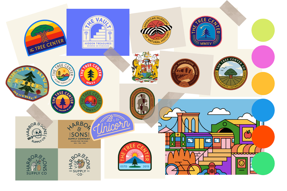
Researching and gathering inspiration are vital in any visual design project. It allows designers to explore competitors and understand the brand's uniqueness in its market. The Brand Sandwich approach offers valuable insights into the client's perception of their brand, guiding the selection of relevant inspiration. While specific logo design inspiration can be useful for identifying similar ideas that have been done before, relying solely on the logo moodboard may not always be ideal.
Get messy with Logo Sketching
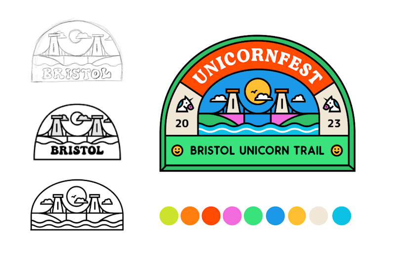
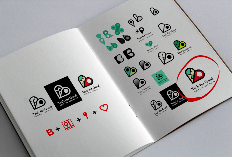
After creating the brand sandwich and gathering general brand inspiration, the next step involves sketching logo ideas. This phase encourages a "more is more" approach, where designers aim to sketch 10+ different logo concepts. A starting point for these logo ideas can be taking words directly from the brand’s word map and sketching them out, usually brands will combine more than one concept into its logo mark.
Embracing the messiness of the process, designers explore diverse possibilities on paper. Some ideas may be refined later, while others serve as inspiration. This experimental approach allows designers to discover unique visual expressions that align with the brand's identity and core values. Through this exploratory process, the most compelling and impactful logo that resonates with the brand and its audience can be uncovered.


No Colours, No Problem
Refining logo ideas from initial sketches should begin with black and white designs. This strategy ensures simplicity and versatility, making sure the logo works effectively in monochrome for all use cases. It's a good practice in logo design to guarantee the logo's effectiveness without relying on colour.
By stripping away colour, designers can focus solely on the core elements of the design. This approach allows them to concentrate on perfecting the hierarchy of content. For logos with text this helps ensure that the brand name or tagline is clear and balanced within the logo. Additionally, they can pay close attention to the sizing and spacing of each component, guaranteeing a harmonious and visually appealing composition. Working in black and white allows designers to assess the logo's readability and visual impact, ensuring that it remains striking and memorable even in its most basic form. Depending on the project you might refine a handful of logos from your sketches into a monochrome version.
Using the iterative logo design process also gives an additional opportunity to receive feedback from the client. Once the logo achieves a good level of clarity and balance without colour, the addition of colour becomes a powerful enhancement that further elevates the brand's identity.


Fonts are Important
Fonts play a pivotal role within a logo, as each font carries its own distinct personality. Choosing the right font is crucial, as it directly impacts how the brand is perceived. Just like selecting the perfect filling for a sandwich, the font should complement and relate to the brand's essence. Whether it's a playful script, a modern sans-serif, or a retro serif, the font sets the tone for the brand's identity and conveys its values. A well-chosen font creates a harmonious blend that resonates with the audience, leaving a lasting impression and solidifying the brand's unique identity.
How to Choose a Colour Scheme?
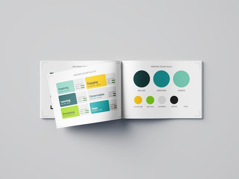
Starting the brand creation process with inspiration gathering is a crucial step. Creating a colour-centric moodboard can be incredibly helpful in identifying the personality of the brand you're building. For example, a natural skincare brand could use a colour palette that reflects a calm and soothing mood, featuring natural, earthy tones that resonate with a more mature audience. On the other hand, a brand targeting young people might opt for energetic and contrasting colours that match the brand's vibrant personality.
Moodboards and inspiration are my go-to methods for developing colour scheme options, but online tools can also assist in generating scheme ideas. Typically, I choose a primary and secondary brand colour, and complement them with a handful of brand adjacent colours to complete the palette. By starting with inspiration and carefully curating the right colour palette, you set the stage for creating a visually appealing and cohesive brand identity.
Once I have a few preferred colour schemes, I test them on various logo variations and use cases. This process helps highlight any potential issues with the logo or colour scheme and ensures the logo remains readable and impactful, regardless of its application. At this stage I am able to present the schemes to the clients and gain their input in their brand refinement.
Once you have a colour pallet you should consider the colour contrast for its use cases, we use the WCAG AA guidelines. Referring the pallet back to the words and themes from the brand sandwich will ensure your chosen colours are suitable and true to the brand.
Make your Style Guide Comprehensive
Once the logo is approved, it's integrated into the brand's style guide. This guide ensures consistent brand usage across digital applications, peripherals, and marketing materials. Including logo spacing and colour variants as rules in the style guide ensures clarity in the brand's presentation moving forward. The logo section should encompass all variations, such as monochrome, full colour, stacked, and any other versions, all of which should be readily exportable for the client's use. The style guide becomes an invaluable tool for maintaining a cohesive and impactful brand identity in the future.


More Tips for Logo design
- Start by creating your brand sandwich, work with the client to define what makes their brand unique. This is invaluable as a reference throughout the branding process.
- Don’t follow visual design trends, always aim for your logo to be timeless. As the most recognisable part of your branding it's the hardest aspect to change.
- Get a second opinion in logo design. Others can offer fresh perspectives and help avoid potential pitfalls. It ensures your logo truly reflects your brand's identity.
- Check your logo design against the brand's personality and the brand sandwich word map you’ve made. This is especially important as you evolve your logo design ideas with colours and fonts.
- Test your logo use cases, if it's likely to be used on socials, on merchandise or in print, being able to quickly mockup these use cases will ensure the logo is appropriate.